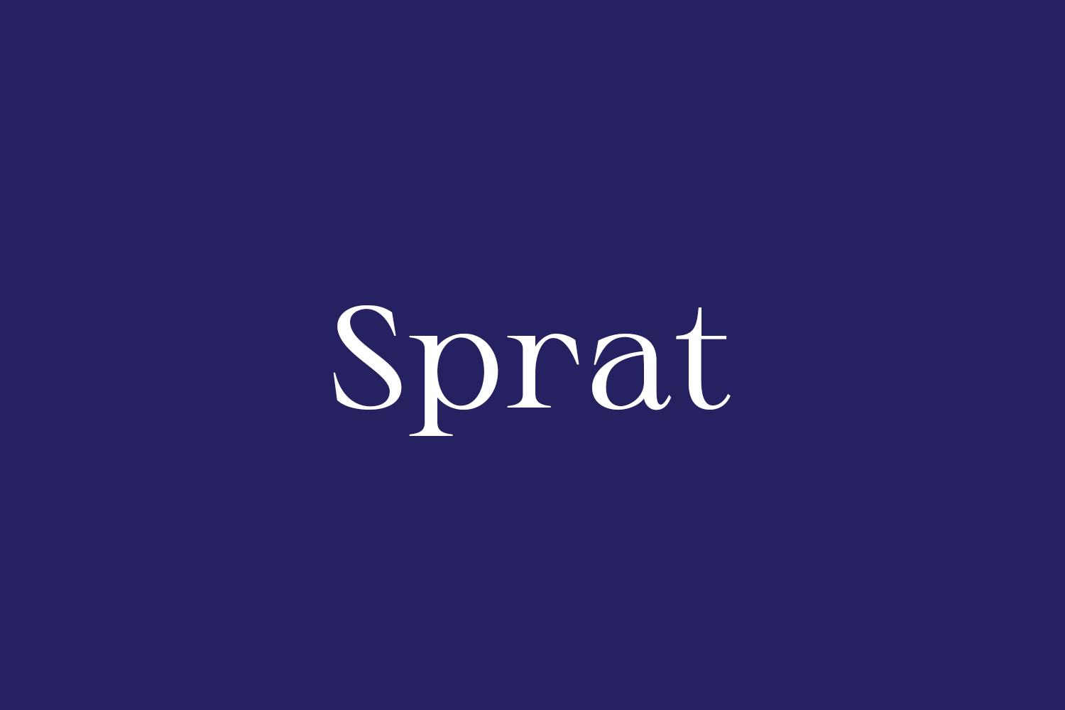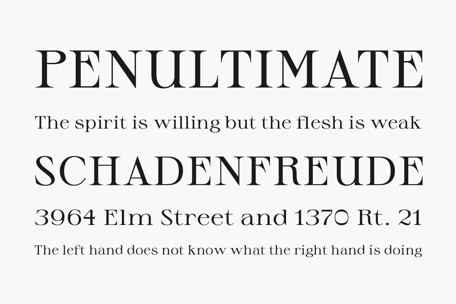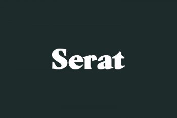
For about a year I have been working on a type design project: The Sprat. The design began with a workshop, the origin being an alphabet by Eric Gill. From this workshop was born a first serif display version with long sharp serifs and a high contrast between thin and thick, a very high crossbar and a round design for the curves. I chose to pursue this project for my diploma by developing a variable font on two axes: width and weight, as is more commonly found in non-serifs font. The idea is to design a very complete display typeface family (from condensed thin to extended black) and whose use could vary according to style and weight. The different versions can work together as well as individually. Its use is mainly suitable for titling, poster, logo but depending on the style the Sprat also works in a mid-sized body text. To date, Sprat Free Font Family is available in 3 styles (condensed, regular and extended) and 6 weights (thin, light, regular, medium, bold and black) with 230 glyphs, it covers the extended Latin language.
Feel free to use it !! If i have a chance to see your work with my typeface i’ld be glad.
Designed by Ethan Nakache
Try this font
Inside: TTF Size: 636 Kb
Note: the link will expire in one hour. If you want to report a violation, you can write to us about it on the Contact page.

