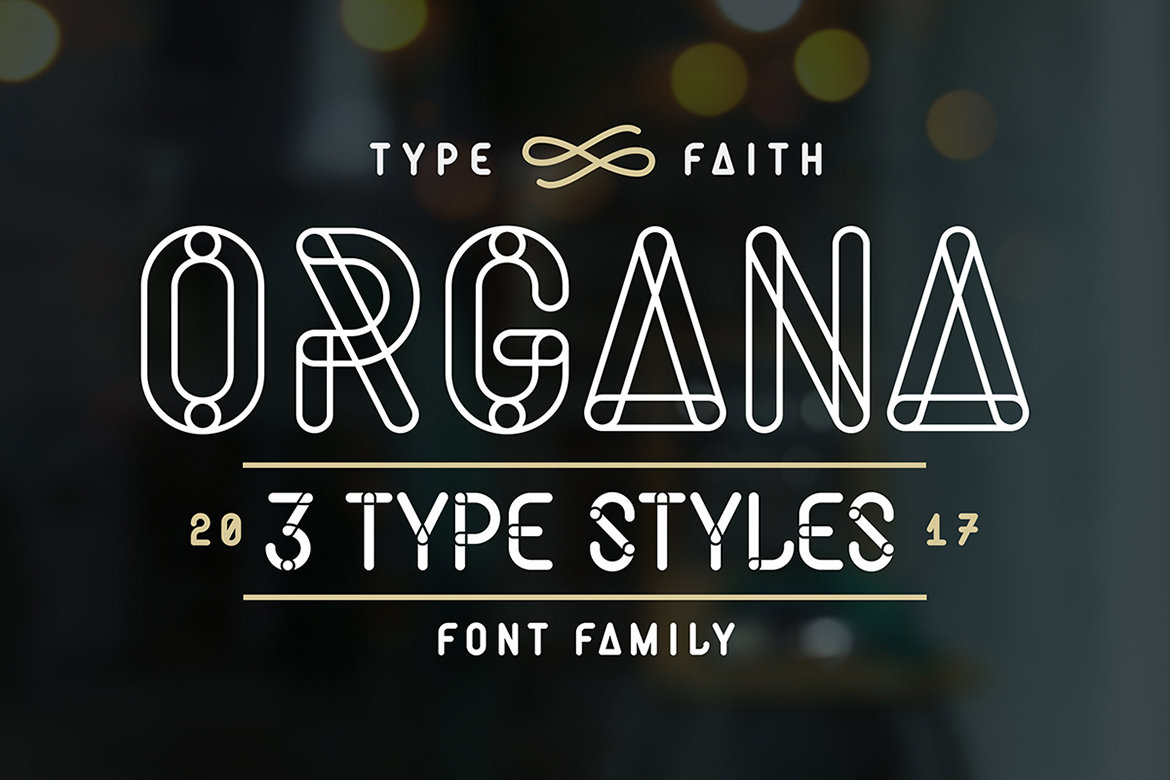
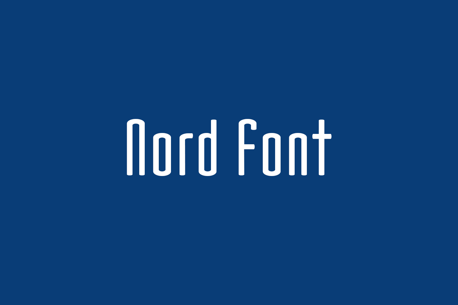
The name Nord is, actually, my misspelling to Node (it is where plant’s stem/branch starts to grow). I had not aware of it for a long time, and now I leave it misspelled. So, the imege of Nord does not come from Scandinavia – Nord is an old French term for Northern, Nordique means Scandinavian. The shape with the ovals in the same proportion for the terminals/curves in letterforms, it suggested me the imege from plant. That is why the name came from. I maintained the bold complement which had been completed in 1992, then exhibited it as free font.
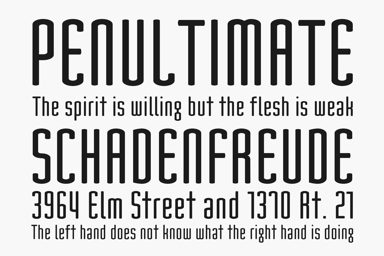
In 1999, Donald Beekman sent me his work of my Nord included its thinner/thicker variations. Regular weight for Nord Free Font Family had been already on drawing board, and I decided to add more complemental versions to it by seeing his work. Now its Regular and Black weights are newly available.
Later, I added more complements for Nord as Extended Family: Small Caps, Large Lows (enlarged lower cases as upper cases) and Composite (a combination of these two complements).
Designed by YOFonts
Try this font
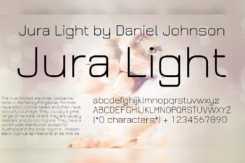
Nord Regular The quick brown fox jumps over the lazy dog
Nord Bold The quick brown fox jumps over the lazy dog
Nord Black The quick brown fox jumps over the lazy dog
Inside: TTF Size: 86 Kb
Free Download
Note: the link will expire in one hour. If you want to report a violation, you can write to us about it on the Contact page.
Advertising
Unlimited Digital Assets
Unlimited downloads
22+ million premium assets
Full stack of AI features
Lifetime commercial license